
Simplifying Union Coop:
A Fresh Approach to Digital Shopping
Simplifying Union Coop:
A Fresh Approach to Digital Shopping
Overview
Why I Decided to Redesign the Union Coop App...
As a busy working mom of two, I’m always looking for ways to save time so I can focus on what really matters, like spending quality time with my family.
My story ...
Before switching to online shopping, I used to visit Union Coop regularly for groceries. Their products were always fresh, available in bulk, and perfect for my family’s needs.

However, as my schedule got busier, finding time for physical grocery trips became more and more difficult.
I decided to try the Union Coop app, hoping it would offer the same convenience and quality as the in-store experience. Unfortunately, the app felt cluttered, with unfriendly interface, poor UI, and a confusing layout. Finding products quickly or navigating efficiently was a challenge.


🤷🏻♀️ The Core Issue
🤷🏻♀️ The Core Issue
The main issue with the Union Coop app is its non-user-friendly experience, poor interface, and confusing layout.
Users struggle to find products quickly and navigate the app efficiently, leading to frustration and a diminished shopping experience.
This complexity contrasts with the simplicity and convenience users expect from an online shopping platform. The app's design fails to effectively support users' needs, making it difficult for them to easily access the products they want.
👀 Research
👀 Research
After conducting research on the UAE market, I identified key competitors such as Carrefour and Instashop.
To gain deeper insights, I explored their apps and evaluated their user experience. During this process, I was particularly impressed by Carrefour’s app, which stood out due to its intuitive design and seamless user interface.
The app’s easy navigation, quick product discovery, and smooth overall experience left a lasting impression on me, and I eventually became a loyal customer. The contrast between Carrefour’s user-friendly experience and the challenges faced with the Union Coop app highlighted the need for a more simplified and accessible design.


🔍 Competitive Analysis
🔍 Competitive Analysis
After benchmarking key players like Carrefour and Instashop, I identified three major UX gaps in the Union Coop app:
Overcrowded Homepage – Users were overwhelmed by the number of icons, offers, and banners presented all at once.
Unclear Navigation Flow – There was no clear starting point or primary action for the user.
Lack of Personalization – Unlike Carrefour, which offered tailored product suggestions and easy reordering, Union Coop’s interface felt generic and transactional.
These insights helped me define the redesign goal:
To simplify the user experience by decluttering the homepage, improving information architecture, and guiding users through a smoother shopping journey.
📱 Current Homepage – UX Analysis
📱 Current Homepage – UX Analysis
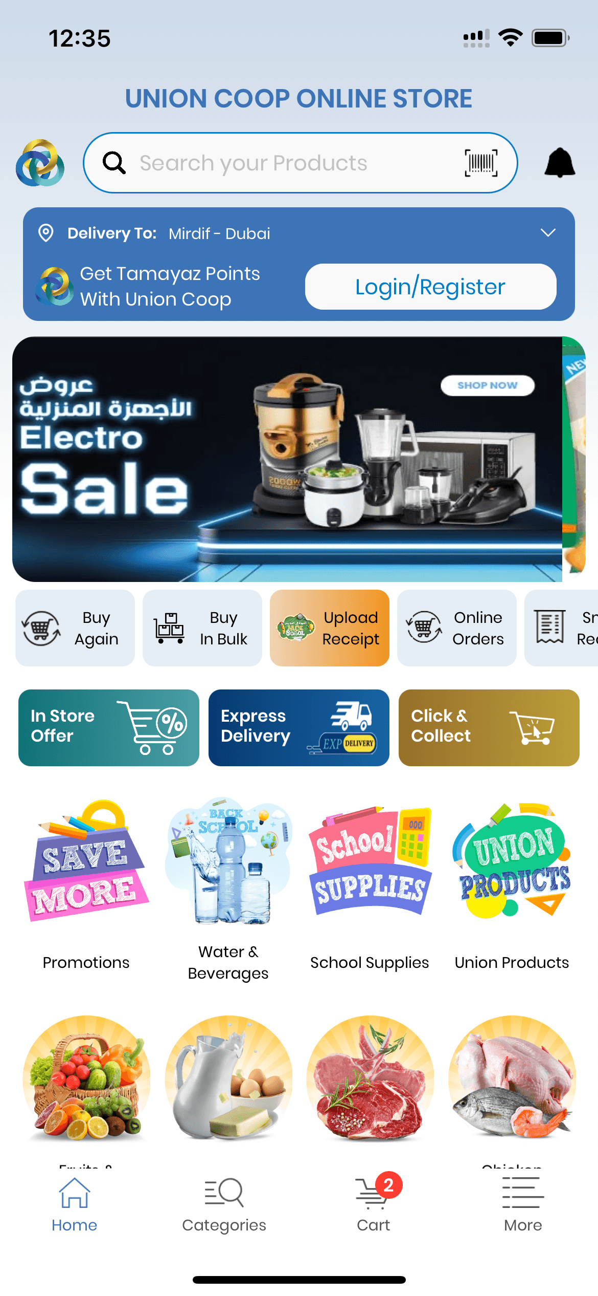
A large amount of space is used solely to display the store name, which is unnecessary — when users open the app, they already know which store they are in.
A large amount of space is used solely to display the store name, which is unnecessary — when users open the app, they already know which store they are in.
In general, the header section wastes a lot of space on non-essential elements, such as showing the logo twice, displaying a long loyalty program message, and placing the delivery/location address in the wrong spot.
In general, the header section wastes a lot of space on non-essential elements, such as showing the logo twice, displaying a long loyalty program message, and placing the delivery/location address in the wrong spot.
The promotions section uses an automatic carousel, but there’s no clear visual cue indicating that it’s a slider.
The promotions section uses an automatic carousel, but there’s no clear visual cue indicating that it’s a slider.
Very crowded,no visual hierarchy. poor UI, Non necessary actions like Online orders, save receipt
Very crowded,no visual hierarchy. poor UI, Non necessary actions like Online orders, save receipt
The banner space is large but fails to drive immediate user action. The design looks static and non-clickable, reducing engagement with featured promotions.
The banner space is large but fails to drive immediate user action. The design looks static and non-clickable, reducing engagement with featured promotions.
The ‘Express Delivery’ option is not well-positioned or visually highlighted. Since delivery choices are important upon entering the page, it should be more prominent and clearly separated from other actions.
Navigation icons are too small and visually weak compared to the main content. The “Home” icon is not clearly highlighted, making it harder for users to recognize their current location. No quick access for high-priority actions like “Deals” or “Best Offers.”
Navigation icons are too small and visually weak compared to the main content. The “Home” icon is not clearly highlighted, making it harder for users to recognize their current location. No quick access for high-priority actions like “Deals” or “Best Offers.”
The ‘Express Delivery’ option is not well-positioned or visually highlighted. Since delivery choices are important upon entering the page, it should be more prominent and clearly separated from other actions.
👩🏻🎨 UI Analysis
👩🏻🎨 UI Analysis
1. Visual Overload, Inconsistent Design Language: Multiple icon styles, colors, and image sizes compete for attention.
Users may feel overwhelmed and unsure where to start.
2. Weak Visual Hierarchy: No clear “primary action”, everything looks equally important.
3. Navigation Inefficiency: Icons at the bottom (Home, Categories, Cart, More) are too small and compete with the main content above.
4. Lack of Personalization: Feels like a generic catalog rather than a tailored shopping experience.
👩🏻🎨 📱 UX/UI Solution – Redesigned Homepage
👩🏻🎨 📱 UX/UI Solution – Redesigned Homepage
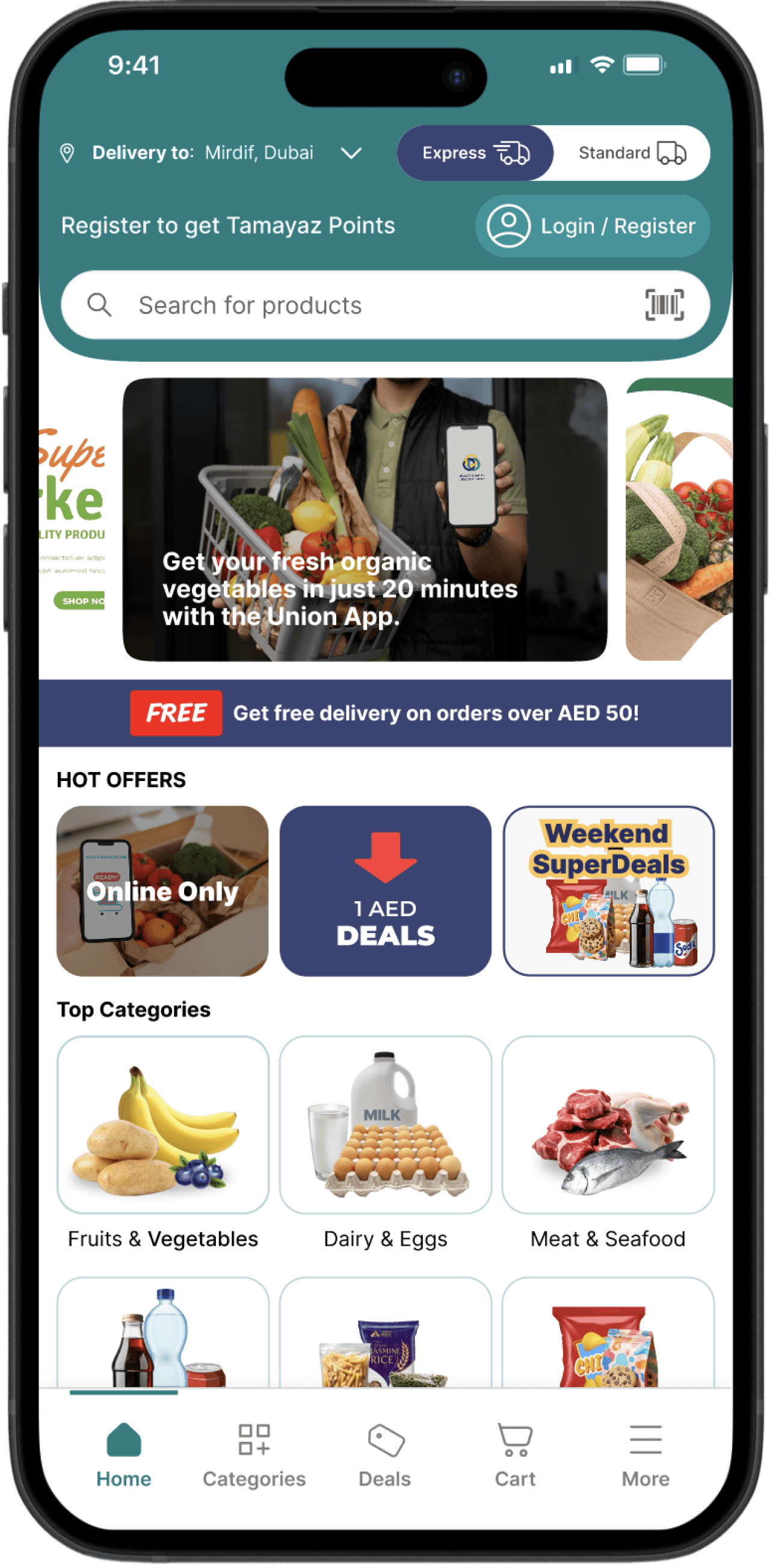
Clear & Logical Information Flow
Promotional banners and news updates
Important notices (e.g., free delivery )
Highlighted Important Notices
Important notices (e.g., free delivery )
Highlighted “Hot Offers”
I grouped all high-value and limited-time deals in one dedicated section. This reduces the effort required to find promotions and deals
Enhanced Footer Navigation
I added a Deals tab in the bottom navigation to give users constant access to offers. This tab provides a single place where all deals are instantly visible, reducing the time and effort required to find discounts.
Refined Category Layout
Categories are now visually balanced with consistent icon styles, clear labels, and logical grouping. Starting from Top Categories that reflect the most visited and frequently purchased items.
Unified Header Island
All key information—delivery location, delivery options, loyalty program access, login and search bar. This design reduces cognitive load, speeds up user decision-making, and ensures essential details are visible at first glance.
Unified Header Island
All key information—delivery location, delivery options, loyalty program access, login and search bar. This design reduces cognitive load, speeds up user decision-making, and ensures essential details are visible at first glance.
Clear & Logical Information Flow
Promotional banners and news updates
Important notices (e.g., free delivery )
Highlighted Important Notices
Important notices (e.g., free delivery )
Highlighted “Hot Offers”
I grouped all high-value and limited-time deals in one dedicated section. This reduces the effort required to find promotions and deals
Enhanced Footer Navigation
I added a Deals tab in the bottom navigation to give users constant access to offers. This tab provides a single place where all deals are instantly visible, reducing the time and effort required to find discounts.
Refined Category Layout
Categories are now visually balanced with consistent icon styles, clear labels, and logical grouping. Starting from Top Categories that reflect the most visited and frequently purchased items.
UX: The redesign simplifies the home screen, establishes a clear information hierarchy, and makes key features instantly accessible, resulting in a more intuitive, efficient, and engaging shopping experience.
UI: Unnecessary elements were removed, color usage was streamlined, and whitespace was increased to create a cleaner interface. This reduces distractions, improves focus, and enhances overall visual comfort.
Project in Progress – Final touches coming soon...⏳
Project in Progress – Final touches coming soon...⏳